


For Pros, and the ones who want to become experts.
Whether you're a solo designer or part of a team, a junior or a senior, at an agency or a large organization, Prime has you covered.
It’s not about number of components. With top Figma tricks & techniques, battle-tested design system approach, Prime supercharges your skills, and empowers you to work at warp speed.


No-fluff.
Here is what you get


Best practices
World-class standards inside
Semantic tokens
Meaningful styling is the foundation of design systems. Use techniques from world-class design systems, not random UI kits.
Proper component exposure
When you need to find component, swap an instance you see the preview of the main UI element. So fast and convenient!
Component excellence
Thanks to the right naming conventions, consistent structure, components keep overrides, helping you to iterate faster
4pt soft-grid system
Design with consistent layout spacing & radius system thanks to variables. With modes you may prepare themes for spacing.
True accessibility in mind
More than WCAG, colors are using APCA, and they are synced with each other, so you may easily swap tones from the palette.
Universal typography
Well-crafted typography scale allows you to prepare design for all devices from web, desktop, mobile or even wearables.
Variables & styles
Professional set of variable collections to configure colors, spacing, radius. Prepared to be easily customized & expanded.
Top-notch effects
Glassmorphic blurs, shadows and other effects combined together to work for you under one beautiful & consistent system.
Auto Layout
All new features including wrap content options are used to get most of the Figma to create easy to use components.
Variants & properties
Configure components conveniently with the set of intuitively prepared properties.
Phosphor Icons
Set of world class Icons used as a base iconography elements within the kit. Outline & fill styles included.
Dark & light modes
All components with proper variable tokens setup include the dark mode. Works automatically.

“
I love the structure of the kit, access & edit all components very quickly. Prime kit is an awesome way to speed up your workflow.”

Jan Mraz
Co-Founder Atheros,
Design Influencer
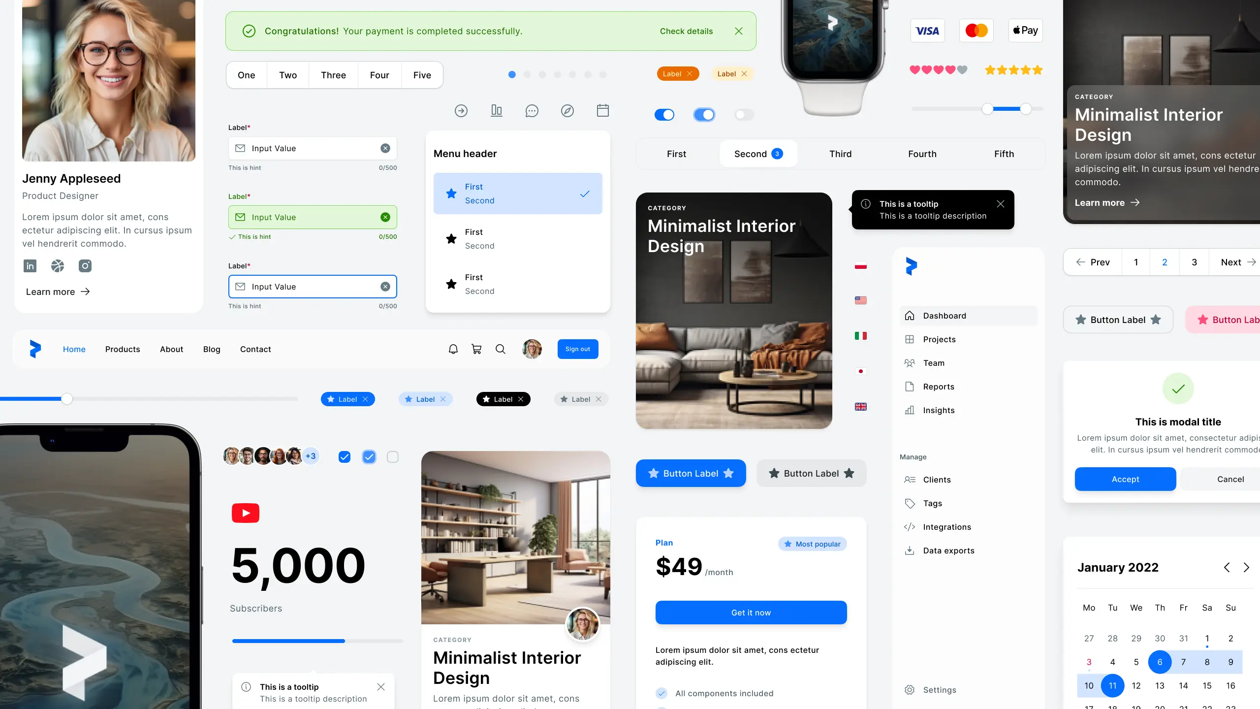
Pixel-perfect & super smart Components

Alerts

Avatars

Button Groups

Tooltips

Buttons

Cards

Content

Inputs


Supafast customization
Start project with 80% of UI design done.
Edit key color tokens and you have all your components ready with dark & light mode updated automatically.
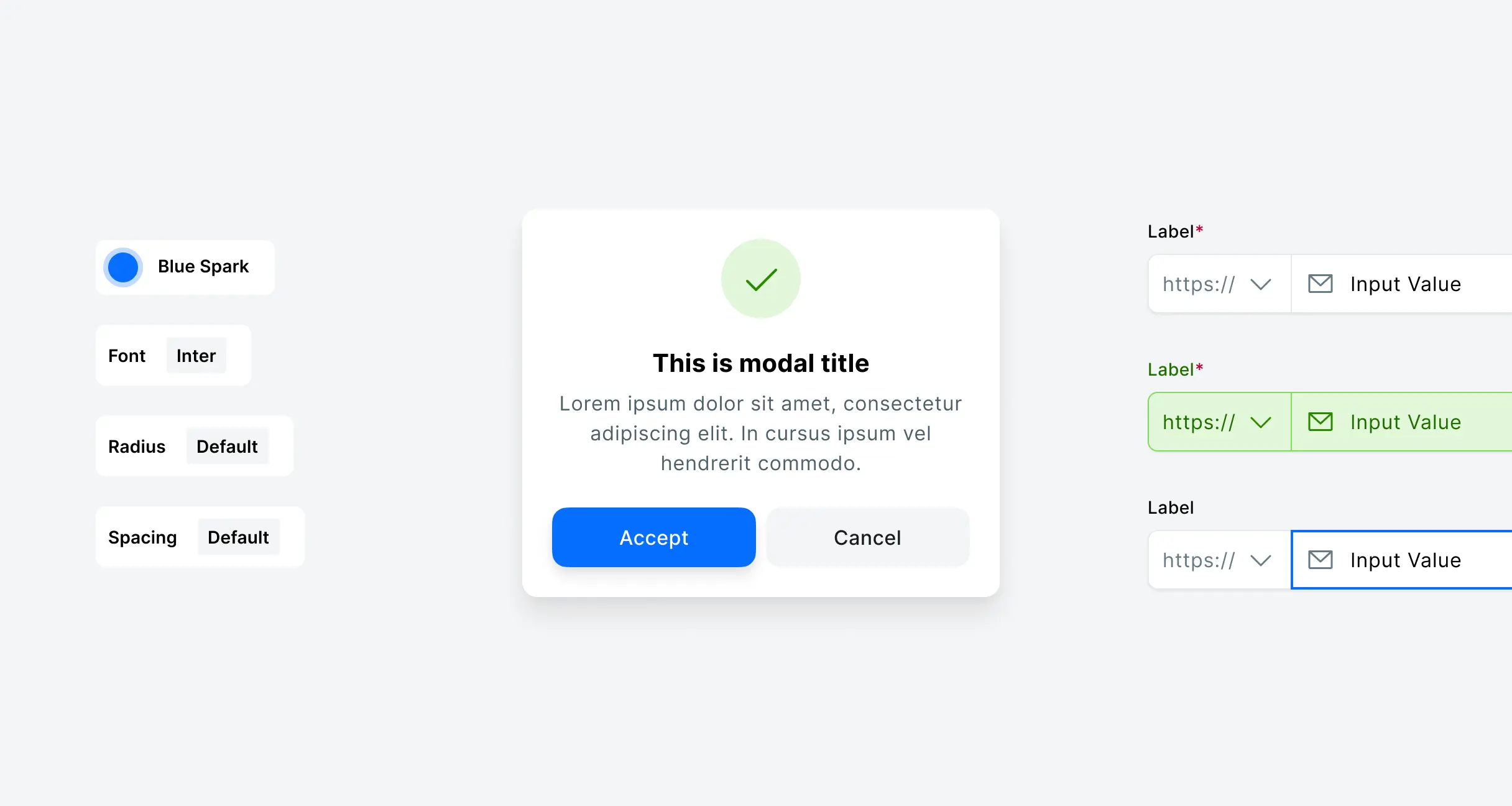
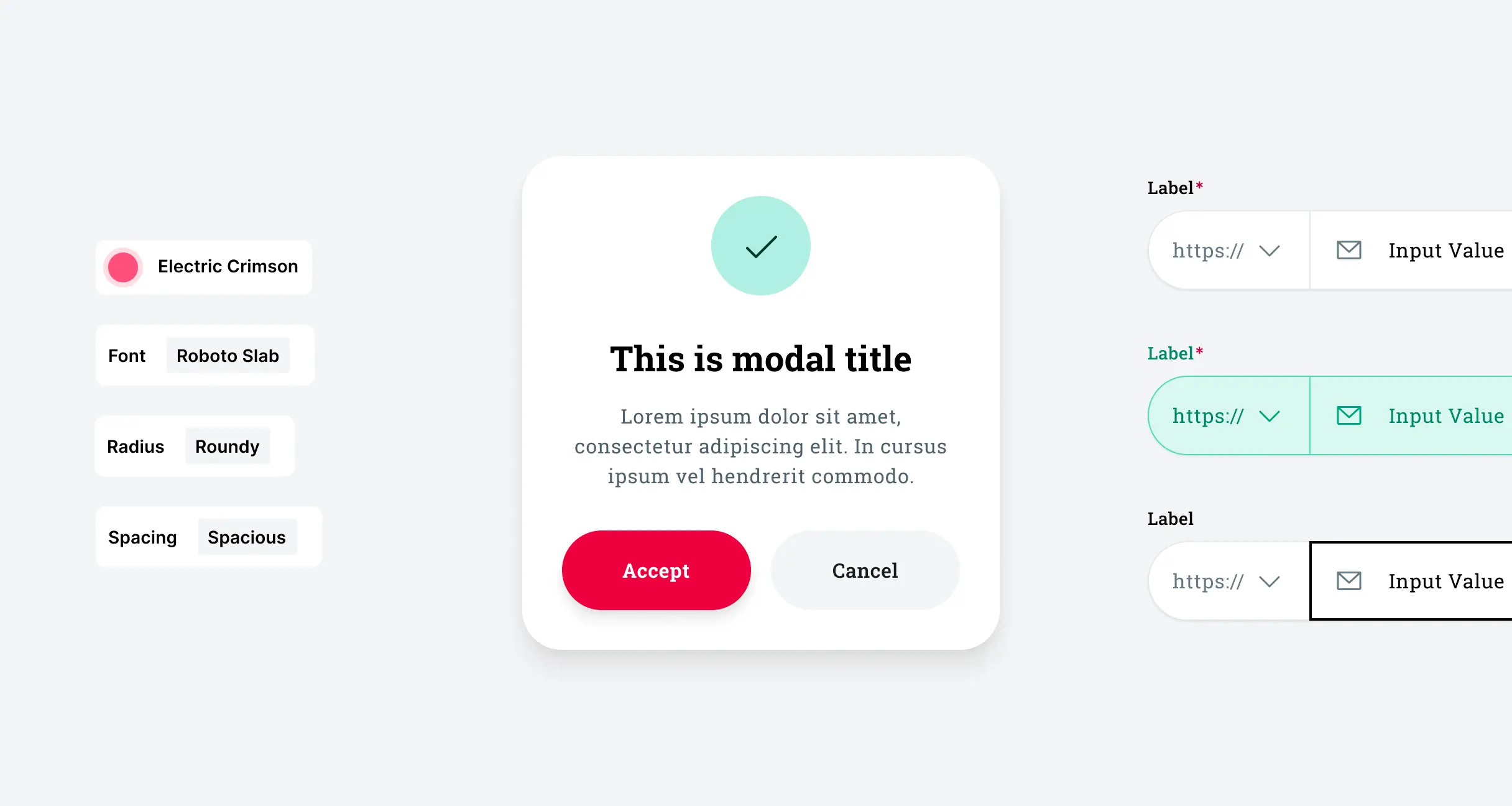
Dark & light mode
For all components
Crafted with accessibilty in mind. Ready to be expanded for additional color themes.

It speaks for itself
Bunch of feedback from
Prime users
"Probably the best system so far I was working with. Fully responsive, sleek and easy to customise. Elegant typography and attentiveness to every detail stole my heart."
Maria
"The design system you've created looks unbelievable."
Kyle G.
“I bought this a long time ago, and it has been super useful to me. Thank you for all your great work. (...) there is a lot of web app components which is also super useful.”
Nathan W.
“I can image that's a huge time saver for most designers and above all, it also looks very good."
Jaer P.
"It's really helpful and exactly the structure I was looking for and was planning to spend many hours on.”
Drew R.
“Monumental asset for not only my course projects but also my career.”
Kyle
"The design system you've created looks unbelievable."
Kyle G.
"It's really helpful and exactly the structure I was looking for and was planning to spend many hours on.”
Drew R.
“Monumental asset for not only my course projects but also my career.”
Kyle
"Probably the best system so far I was working with. Fully responsive, sleek and easy to customise. Elegant typography and attentiveness to every detail stole my heart."
Maria
“I can image that's a huge time saver for most designers and above all, it also looks very good."
Jaer P.
“This is a really nice UI Kit”
Crissa A.
Simple choice.
Get the Kit or all UX/UI resources I prepared to save your time.
Prime Design System
for Figma
$99
$89
Start every project with best Figma & design system practices.
3,100+ Components with properties
Design system tokens with Variables
Automatical Dark & Light mode
New Auto Layout features
Best Figma practices
50% Educational discount available.
30-day money-back guarantee

All UX/UI Resources
for Figma, Framer & more…
$159
/year
Prime Design System for Figma
Designfolio Framer Template
Minimalist Resume Framer Template
SQUID User Flow Kit for Figma
Motion Design Template for Figma
Illustration Kit for Figma
UX Deliverables
+ more assets, total value $600+
Thalion Tools Unlimited Access is a yearly membership.
Auto-renews. Cancel any-time.